Testing every locale and theme without the explosion
Visual testing across locales, themes, and breakpoints explodes combinatorially. How to scope coverage per component with modes instead of testing one axis and hoping.
 Igor LuchenkovBuilding UI Verify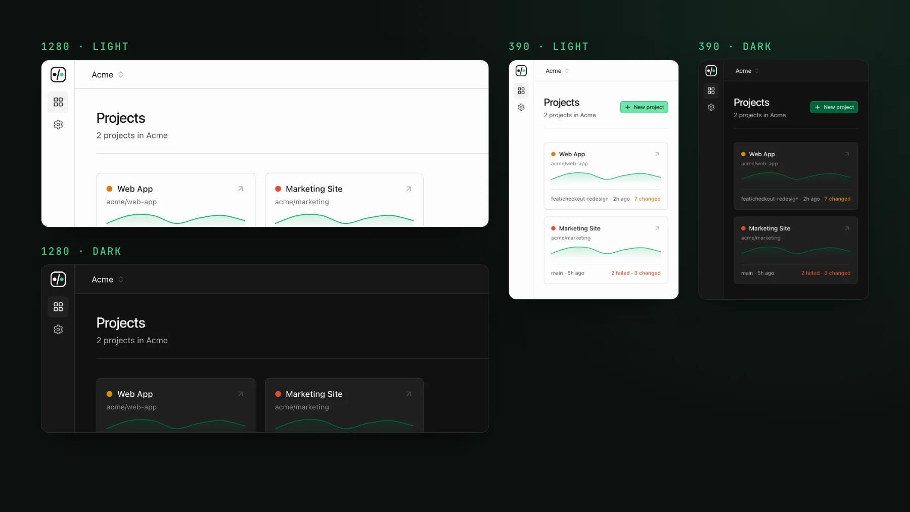
On this page
Visual testing across locales, themes, and breakpoints multiplies into hundreds of variants per screen faster than any team wants to admit. You start with a component, decide it should be checked in a few languages, in light and dark, at a couple of widths, maybe on two platforms, and the count per screen runs into the hundreds. Then you have fifty screens. This post is about how to keep the coverage and lose the matrix.
One team's multiplication
Do the multiplication for a product made of hundreds of small screens sharing common components: a handful of locales, two themes, two platforms. It is an enormous number of tests. The answer most teams land on is to test the main locale on the main platform and hope. Nobody writes that decision down. It is a config that started small and never grew, and it leaves every other locale and the light theme untested, which is where the bugs hide.
| Axis | Values | Running total per screen |
|---|---|---|
| Locales | 6 | 6 |
| Themes | 2 | 12 |
| Platforms | 2 | 24 |
| Breakpoints | 3 | 72 |
Do you have to test everything everywhere?
No, and pretending otherwise is why teams end up on one axis. Coverage costs snapshots, snapshots cost time and money, and testing every combination on every commit is neither free nor fast. The fix is not "test everything". It is to choose the axes that matter per component, on purpose, and to fold the cheap axes into the snapshot rather than multiplying it.
Fold the theme into one snapshot
This is the trick I used at my day job before I built any of this. We have a decorator on every story that, when captured, renders the story in light mode and then again directly below it in dark mode, in one frame. One snapshot, both themes, a two-times reduction on the bill with no loss of coverage. It caught a real bug: someone changed a text colour that was fine on white and invisible on the dark background, and only the dark half of the frame showed it.
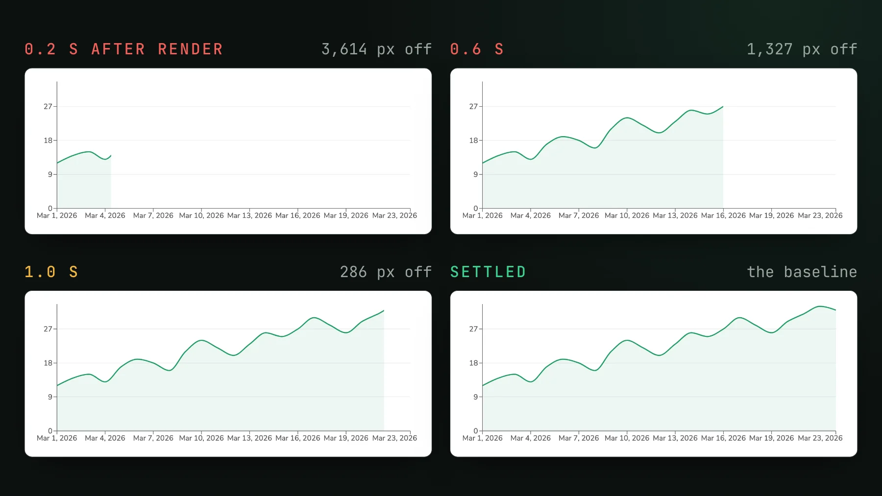
It also taught me the flake that comes with it. The decorator filled the dark half with a debounced clone about a second after the first render, so a single height measurement raced it and produced false size-changed diffs in both directions. "Wait for the DOM to go quiet" was the wrong fix, because the debounce leaves a window where the DOM is quiet and the timer is still pending. Draining the timers fixed it: six of eight drifting runs became zero of eight. If you fold axes into a frame, make sure the frame is finished before it is captured.
Declare the axes that need their own baseline as modes
Some axes should not be folded, because you want a separate baseline and a separate accept for each. Dark mode on a themed component, a mobile width on a layout-sensitive one. UI Verify modes let you declare, per story or per component file, which viewport and theme combinations that component is captured across. A component whose colours flip gets a theme mode. A component that reflows gets a viewport mode. A static internal table gets neither. Each mode is its own snapshot with its own baseline, so accepting dark never touches light. Modes are declared on the story, in the same shape Chromatic reads, so an existing config carries over:
export const Invoice = {
  parameters: {
    uiVerify: {
      modes: {
        desktop: { viewport: "desktop" },
        "mobile-dark": { viewport: "mobile", theme: "dark" },
      },
    },
  },
};Modes are viewport and theme; the details, including how the theme value reaches your Storybook, are in modes. Locale is not a mode, and I would not make it one: a language is data, not an environment. Drive it as a story arg or a global instead, and cover the languages that stress layout, the long ones and the right-to-left ones, in a gallery story that renders the same component in each, side by side, as one snapshot. The economical visual tests skill is the playbook for that pattern.
Intl formatting for the dates and prices, one snapshot. Every locale that stresses layout shows up in a single image.Which components deserve which axis?
Be concrete about which components deserve which axis. A component that formats currency or dates, or has to survive right-to-left text, deserves the locale gallery. A component whose colours are hardcoded anywhere deserves a dark mode. A component with a sidebar or a grid deserves a narrow viewport. A settings toggle that renders the same in every language deserves none of them. Customer-facing, layout-sensitive surfaces, the checkout, the pricing page, the marketing hero, earn more axes because a bug there is seen by everyone. Internal dashboards earn fewer. Our own Storybook follows that split: the 22 story files that declare modes are all part of the public marketing site, and none of the dashboard's story files declares one.
modes.ts and applied to the pricing page and the rest of the public site. The dashboard stories declare none.The last piece is not re-rendering the matrix you already trust. With skip unchanged, a pull request only captures the stories your change could have affected, across every mode they declare, and carries the untouched ones forward. So the matrix can be broad without every build paying for all of it. Pick axes per component, not one matrix for the app. That is the difference between coverage you can afford and a matrix you turn off.
Cover the axes that matter
Declare per-story modes for the viewports and themes each component actually needs, fold the rest into gallery stories, and let skip-unchanged keep the bill sane. Start with the free tier.
Start for freeNo credit card required.
Write economical visual tests
Full visual coverage in the fewest billable snapshots.