Screenshot testing, explained (and when it earns its keep)
Screenshot testing captures a reference image and diffs it pixel by pixel on each change. How it works, why pixel thresholds fail, and when it pays off.
 Igor LuchenkovBuilding UI Verify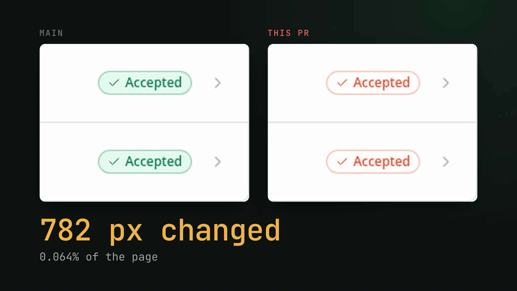
On this page
Assertion tests check that a value is what you expect. Screenshot testing checks that your UI looks the way you expect. The two catch different bugs, and if you only have the first kind, a whole class of regressions ships without anyone noticing: the button that moved, the text that overflowed, the component that quietly stopped rendering where it should.
Here is a small one from our own dashboard, on a PR we use to test our check. It set out to polish a sparkline and a status dot, and it also turned every "Accepted" badge on the build page the red we use for failures. Every unit test stayed green, because the badge still read "Accepted", and that text is what an assertion checks. That is the gap screenshot testing fills. Below is what it is, where the naive version bites, and the one nuance that decides whether it is worth it for a given surface.
What screenshot testing is
Screenshot testing captures a reference image of your UI - a component, a page, a single state - then compares every later render against that reference pixel by pixel and flags the difference. The reference is called the baseline. The first run has nothing to compare against, so it just records the baseline. Every run after that is a comparison: identical pixels pass, changed pixels surface as a diff for a human, or an agent, to judge.
That is the whole loop: capture, compare, flag. It is sometimes called visual regression testing, and the longer definition lives here. The mechanics are simple. The judgment is where it gets interesting.
How it differs from assertion tests (and why you want both)
| Assertion test | Screenshot test | |
|---|---|---|
| Checks | A value or a behavior | The rendered pixels |
| Catches | Wrong logic, broken state | Layout shifts, overflow, missing or misplaced UI, style drift |
| Misses | Anything visual it does not assert | Anything below the tolerance |
| Best for | Business logic, user flows | The look of the UI a human actually sees |
Assertion tests are precise, cheap, and you should keep writing them. But you cannot practically assert every pixel of every component in every state. Screenshot testing does that for you: one capture covers the whole rendered surface at once, including the parts you would never think to write an assertion for. That is exactly the coverage teams miss. End-to-end tests check that a user flow completes, unit tests check a component's behavior, and nothing checks whether the page visually held together.
Where naive screenshot testing goes wrong: the threshold trap
The classic setup diffs two PNGs and fails if more than some percentage of pixels changed. Sounds reasonable. In practice it puts you in a vice.
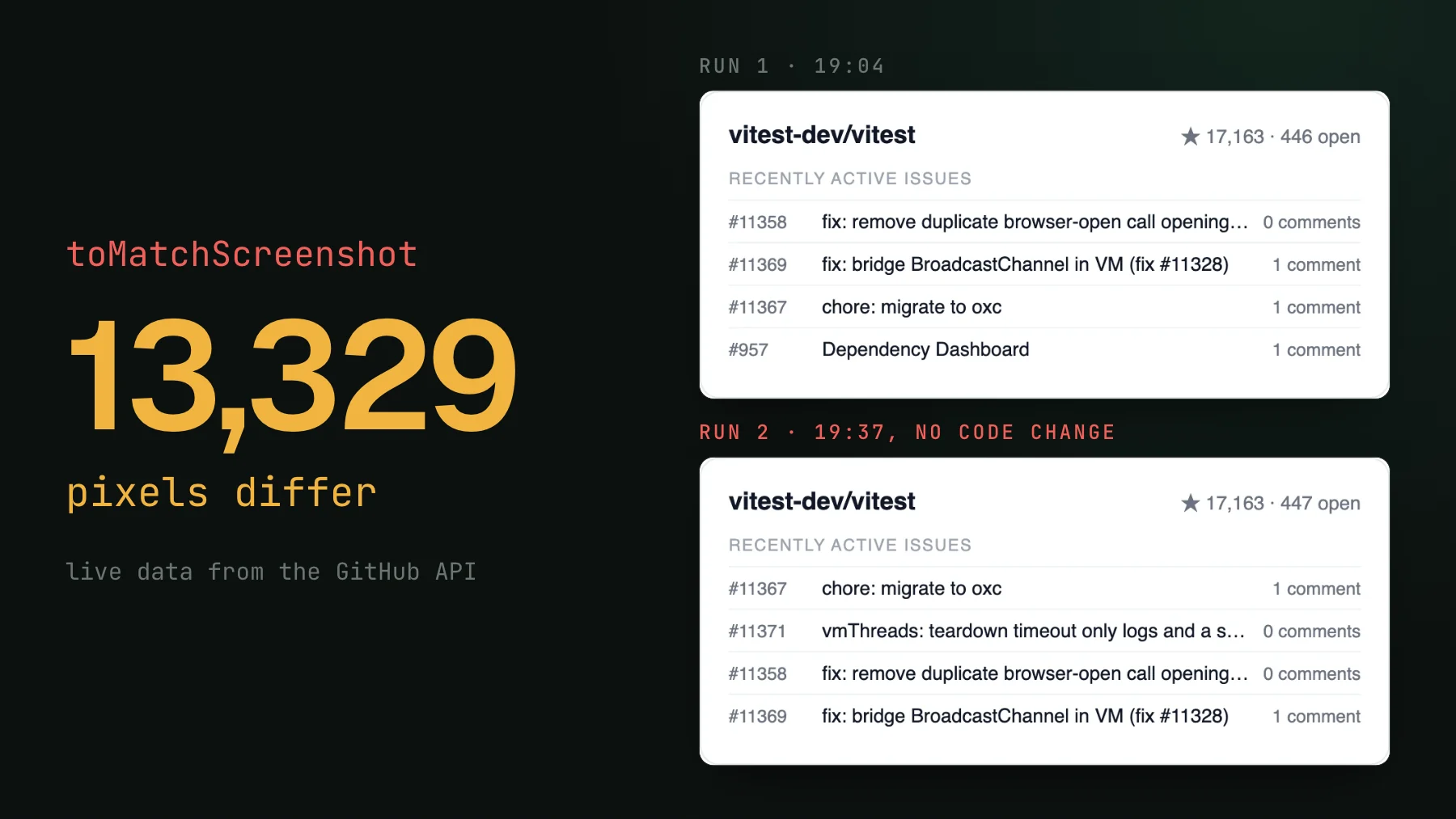
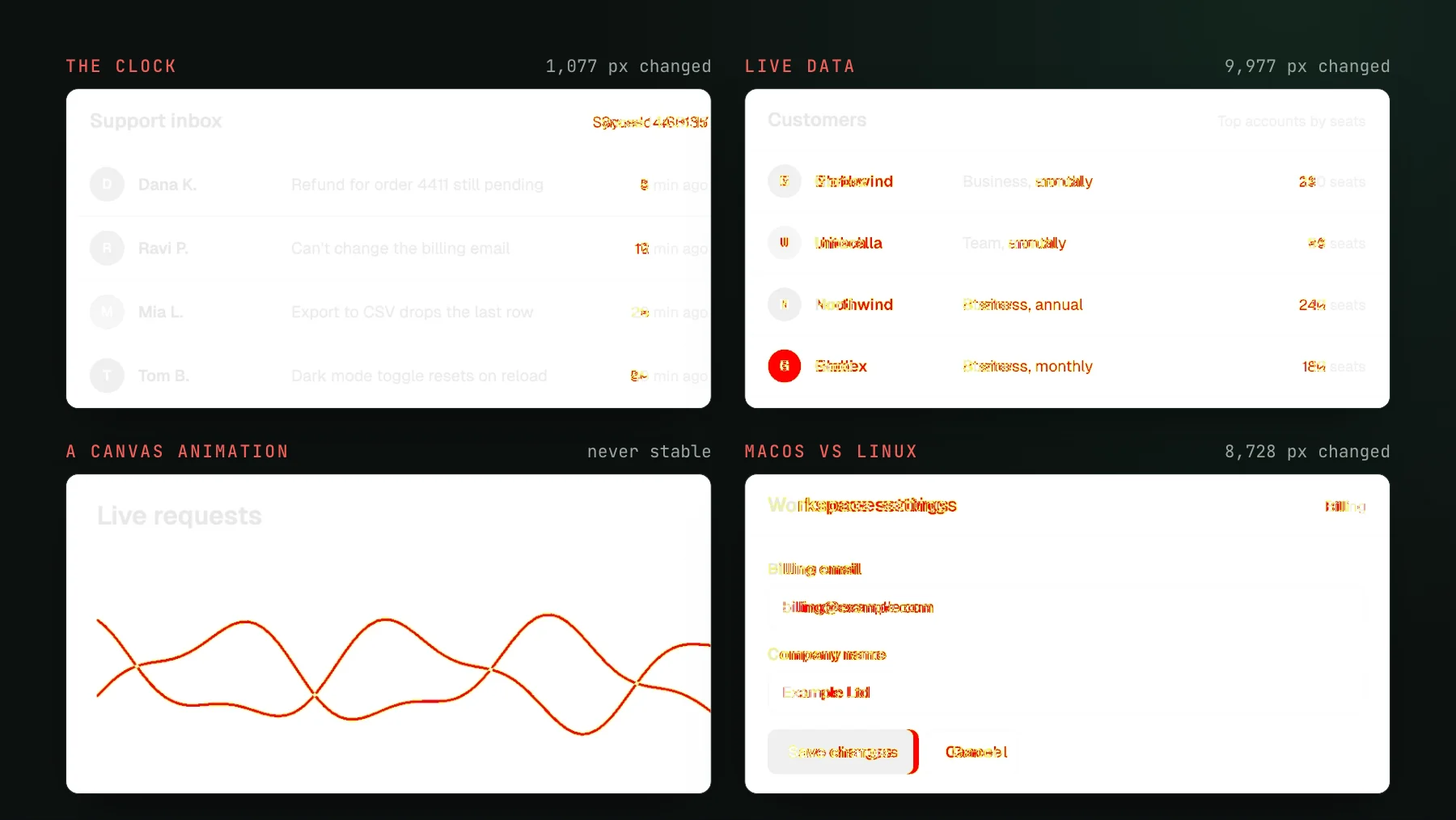
Capture the same page twice on a real machine and the two images are rarely byte-identical. A font renders a hair differently, an anti-aliased edge lands on a different sub-pixel, an animation is caught one frame later. None of it is a real change, but a strict threshold flags all of it. So you loosen the threshold to make the noise stop.
Now you have the opposite problem. A threshold loose enough to swallow sub-pixel font noise is also loose enough to swallow a real regression: a button nudged a few pixels, an icon dropped, a label truncated. The recolored badges at the top of this post changed 782 pixels, 0.064% of the page, so a maxDiffPixelRatio of 0.01 would have passed them. You tuned the number until the tool stopped crying wolf, and in doing so you told it to ignore the wolf. Every team on pixel-percentage thresholds eventually lives somewhere on this spectrum, tuning and re-tuning, and the tuning itself becomes the tax.
The nuance that changes everything: tolerance is surface-dependent
Here is the part naive thresholds get wrong at a deeper level. The same physical shift means completely different things on different surfaces, so no single tolerance is correct across your app.
Take a 3px shift. On a dense desktop dashboard packed with data, 3px is nothing: a rounding wobble inside a busy layout, invisible to any user. On a phone, 3px can be the difference between a button sitting on screen and being clipped off the edge, or a label wrapping to a second line and shoving everything below it down. Same 3px. One is noise, the other is a shipped bug that ends with someone picking up their phone and saying they cannot see that button.
| Surface | 3px as a share of width | Same 3px shift reads as |
|---|---|---|
| Desktop dashboard (~1440px) | ~0.2% | Invisible rounding wobble |
| Tablet (~768px) | ~0.4% | Usually harmless, sometimes not |
| Mobile (~375px) | ~0.8% | A clipped button or a wrapped label |
The reason is proportion. Tolerance should scale with how much of the visible surface an offset represents, not with an absolute pixel count. A percentage threshold tuned on your roomy desktop views will systematically under-flag your mobile ones, and mobile layouts are tighter to begin with, so the same offset has less room to be harmless. That is doubly dangerous, because mobile web is usually the surface designed last and eyeballed least, which is precisely where a breaking change slips through unnoticed.
This is also why the return on screenshot testing scales with the surface. The tighter and more layout-sensitive a view is, the more a small regression hurts and the harder it is to catch by eye, so the more a screenshot test is worth. Mobile web, dense component libraries, anything where a few pixels change meaning: that is where it pays for itself. A forgiving marketing page with lots of whitespace needs it least.
The modern fix: deterministic capture plus a judge that reasons
The threshold trap exists because the capture is noisy. Remove the noise and you no longer need a loose threshold to survive it. That is deterministic capture: freeze animations, stop the clock, seed randomness, inline fonts so they render identically, mock the network so live data does not shift under you. When the same input reliably produces the same pixels, an actual diff means an actual change and not a coincidence of timing. There is a practical checklist for this in Fix flaky visual tests.
Then stop asking a percentage whether a change is acceptable. A percentage cannot know intent. It cannot tell that you meant to move the button, or that a 1px reflow on a dense dashboard is fine while the same reflow on mobile clipped a control. That is a reasoning task, not an arithmetic one. This is where an AI judge comes in: instead of thresholding a pixel count, it looks at the before and after and reasons about whether the change is intended, given what the pull request set out to do. You review decisions, this moved, is that on purpose, instead of tuning a number that is wrong somewhere no matter what you set it to.
That is how UI Verify works. On every pull request it screenshots your UI, from Storybook stories, Playwright or Vitest captures, or real pages, with the determinism handled for you, and an AI judge tells an intended change from a real regression. When it does flag something, your coding agent can pull the diffs over MCP and triage them without you clicking through a dashboard. No threshold to tune, and the tolerance question gets answered per change instead of once for the whole app.
When you don't need it
Screenshot testing is not free and it is not always worth it. If your UI is a handful of forgiving, whitespace-heavy pages that barely change, the manual glance you already do is probably enough. If your regressions are logic bugs, assertion tests catch those better and cheaper. And a screenshot test on a genuinely non-deterministic surface you cannot freeze, like a live feed whose content you do not control, will flake more than it helps until you make the capture deterministic. Reach for it where the layout is tight, the surface is easy to miss by eye, and a few pixels change meaning.
Screenshot testing is a simple idea with one sharp edge: the tolerance is not a number, it is a judgment, and it changes with the surface. Get the capture deterministic so a diff means something, then let something that can reason about intent make the call. Do that and it stops being a maintenance tax and starts being the cheapest coverage you have on the thing your users actually see.
Screenshot testing without the threshold tax
UI Verify screenshots your UI on every pull request with determinism handled for you, and an AI judge tells an intended change from a real regression - so tolerance gets decided per change, not tuned once for your whole app.
Start for freeNo credit card required.
Set up visual testing
From no visual tests to a green check on every pull request.