Why agent-built CSS breaks on mobile
Coding agents write desktop-first CSS that renders perfectly at 1440px and collapses on mobile. Visual regression testing across viewports is the safety net.
 Igor LuchenkovBuilding UI Verify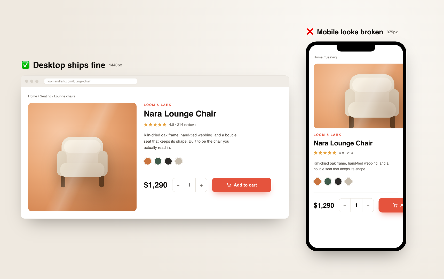
On this page
An agent hands you a pull request. You open the preview on your 1440px monitor and it looks great: clean spacing, everything aligned, ship it. Then a screenshot lands in the team channel from someone's phone and the primary button is gone, pushed off the edge of the screen, or sitting under the header where nobody can tap it. The code was never broken. It was just never looked at below 1440 pixels wide.
The demo storefront later in this post had this bug in a pull request: at 390 pixels wide, the cart's checkout button starts 167 pixels past the right edge of the screen. Agent-written layout often looks like that, pixel-clean at desktop and wrong at every narrower width - overlapping elements, spacing that compounds into a mess, text that wraps in the wrong place, controls shoved off-screen. Far from a rare failure, it is the default for agent-written CSS, and it is getting worse as agents write more of the UI.
Why agent-written CSS is desktop-first by default
An agent optimizes for the width it can see, and the width it can see is the one in the design it was handed. Most designs are drawn desktop-first, so the agent builds desktop-first. Nothing in its loop pushes it to check 375px, because nothing shows it 375px.
- It builds to the desktop mock. The Figma it reads is a desktop frame, so the layout it writes is a desktop layout. Responsive behavior is an afterthought it was never explicitly asked for.
- It hard-codes literal values instead of using your tokens. One engineer described the exact tell: the design says 5px, the spacing token is 4px, and the agent writes
5pxverbatim rather than reaching for the token. At one element it does not matter. At whole-page scale those literals stack into spacing that looks fine wide and falls apart narrow. - It has no intuition for what a human eyeballs for free. A developer glances at a design, thinks "that is a rounding error, use the token," and moves on. The agent takes the mock literally, every time, and never resizes the window to sanity-check the result.
Functional tests pass because nothing is technically broken
This is the part that makes the mobile break so slippery: your test suite stays green through all of it. The DOM is there. The click handlers fire. The unit tests assert the right props and pass. An end-to-end test drives the flow and clicks all the way through, because the button it clicks still exists in the tree even when it is rendered off the visible screen. In the cart below, a Playwright test at 390 pixels asserts that the order summary and the checkout button are visible, clicks checkout, and passes, while both sit past the right edge of the phone.
toBeVisible() only checks that the element has a box, not that a person can see it.So the failure lands in the one gap your CI does not cover. It is not caught by a test, and it is not caught in review either, because the reviewer is looking at the same desktop preview the agent built to. The first real check happens when a user opens the page on a phone.
The mobile break is the surface nobody reviews
For a lot of products, a large share of traffic is mobile web, and yet mobile is the width that gets checked least strictly. The designs are desktop-first, the previews are desktop, the reviewer's monitor is desktop. A breaking change slides straight through: the component ships, and days later someone tries it on their phone and reports that they cannot see a button, or it is misaligned, or it is too big, or it just is not responsive.
One engineer told me about a component that had stopped rendering where it should. He had not touched it, and he could not say how long it had been live. His own read: with agents shipping faster, you are simply less likely to check that everything still works at every width. Verifying mobile by hand, he said, took him about as much time as verifying desktop - so in practice it often does not happen, and the regression sits in production until a user finds it.
Visual regression testing across viewports is the safety net
The check that catches a layout is the one that looks at the layout. Visual regression testing screenshots your UI and diffs it against a known-good baseline, so a shifted, overlapping, or off-screen element shows up as a change you review. The key move for agent-built CSS is to capture the same component or page at several widths, not just one desktop shot - because the whole point is that the desktop shot is the one that looks fine.
UI Verify does this with viewports and modes. Give a story a list of widths and it renders and diffs each one separately, so the same story covers mobile, tablet, and desktop with its own baseline per width:
export default {
  component: PricingTable,
  parameters: {
    uiVerify: {
      // one story, three widths, each with its own baseline
      viewports: [375, 768, 1440],
    },
  },
};When you want a viewport paired with a theme - mobile light, desktop dark - reach for named modes instead, where each entry sets a viewport and a theme and gets its own per-mode baseline. Either way, the diff at 375px is the one that catches the button the agent pushed off-screen, while the 1440px baseline stays clean and confirms desktop never regressed. In the demo storefront's cart, the desktop capture came back byte-identical to its baseline while the 390-pixel capture lost the order summary and checkout.
Why this is newly acute in the agent era
Responsive bugs are not new. What is new is the rate. An agent can lay out a page in minutes and produce width-specific CSS faster than any human can resize a window and eyeball each breakpoint. The old safety net - a developer who wrote the layout, felt responsible for it, and dragged the browser edge in and out before opening the PR - does not scale to the volume of UI agents now generate. Nobody is resizing the window for every page, because there are too many pages and they arrive too fast.
So the manual habit that used to catch the mobile break has stopped happening, just as agents made the break more common. More discipline will not close that gap. Moving the per-width check into CI will, because there it runs on every pull request without anyone remembering to drag a window.
How to set it up
- Turn on visual regression testing for the components and pages your agents touch most, so every PR gets a screenshot diff.
- Capture the widths that actually break: a mobile width, a tablet width, and your desktop width, each with its own baseline.
- Let the diff at the narrow widths fail the PR when a layout shifts, and review the change instead of discovering it on a phone.
- Point your coding agent at the diffs over MCP so it can triage its own responsive breaks, and reserve your eyes for the calls that need a human.
Agents are good at desktop and careless about everything narrower, and no functional test will ever tell you, because nothing is technically broken. A screenshot at each width is the check that sees what they missed. If you want the setup done for you, the visual-testing setup skill scaffolds the captures and the CI wiring, and it is free. Or browse all the visual-testing skills.
Catch the mobile break before your users do
UI Verify screenshots your UI at every viewport on every pull request, and an AI judge tells an intended change from a real regression - so the layout that only breaks at 375px fails the PR, not production.
Start for freeNo credit card required.
Set up visual testing
From no visual tests to a green check on every pull request.