Visual regression testing for a design system migration
Design system migration visual regression testing: baseline every page before the branch, migrate in slices, and sort token shifts from real breakage.
 Igor LuchenkovBuilding UI Verify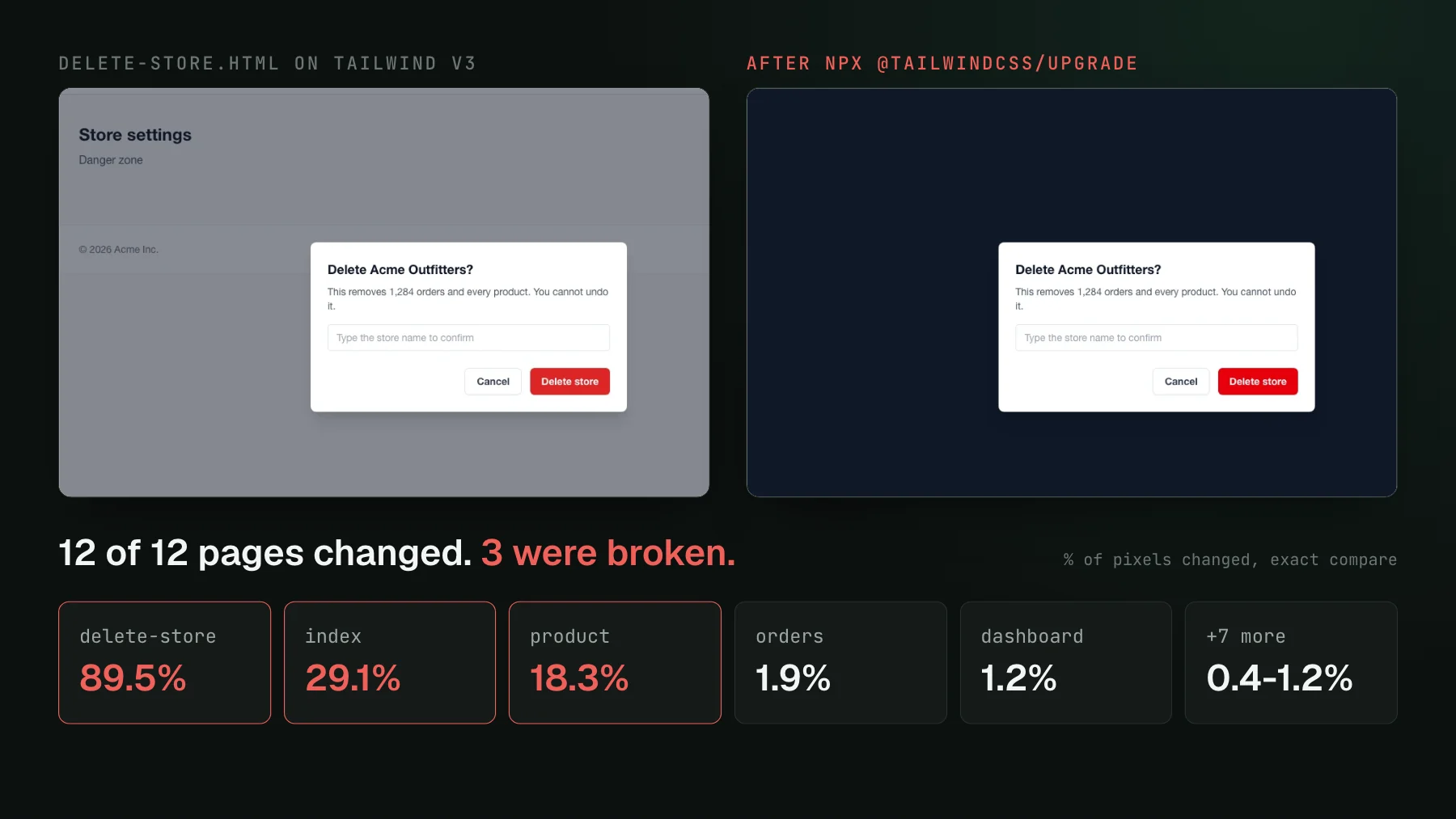
On this page
You are swapping the token set under 200 screens. The codemod ran clean, the type checker is happy, the unit tests never looked at a color in their lives, and the pull request is green. Somewhere in those 200 screens a modal backdrop has gone solid, a ghost button has lost its transparency, and a label has drifted a few pixels to the right. Nobody will open all 200 screens to find out which. That gap is what visual regression testing is for, and a migration is when it pays the most.
To see what a real migration does to a set of screenshots, we built a small storefront in ordinary Tailwind v3: 12 pages, a custom brand palette, a few @apply component classes, the idioms any v3 codebase is full of. We captured every page with Playwright at 1280px, ran the official npx @tailwindcss/upgrade (version 4.3.3), rebuilt, captured again, and diffed each pair with pixelmatch. The site was written for this post. The breakages below were not planted; they are what the upgrade tool left.
What is visual regression testing for a design system migration?
Visual regression testing for a design system migration means screenshotting every page or component on the old system, migrating, screenshotting again, and reviewing every difference before the migration merges. A migration is any change that swaps the layer under your UI rather than the UI itself: a Tailwind major version, a new token set, a component library upgrade, a font or spacing scale. Those changes touch everything at once, so they are the one kind of pull request where no human review of the code can tell you what the screens look like afterwards.
The first thing a migration does to a visual suite is change all of it. In an exact pixel comparison, 12 of 12 pages came back different, from 4,426 pixels on the login page to 916,426 on the delete-store dialog. Most of that is intended: Tailwind v4 ships a new default color palette, so bg-pink-400 and text-red-600 keep their names and change their values. Nobody wrote that change, nobody reviewed it line by line, and it lands on every page that uses a default color.
Why do homegrown before/after checks miss part of a migration?
Because a check that has to ignore the intended noise ends up ignoring some of the real changes too. A frontend developer at a web agency that maintains many client storefronts described their version: while moving projects from Tailwind v3 to v4, they built an agent skill that drives Chrome, captures the previous and the new version of each page, and compares them. By their own estimate it finds roughly three of five rough spots. The small ones slip through, reach production, and come back as bug reports.
Our run reproduced that shape with nothing more exotic than a default setting. At pixelmatch's default threshold of 0.1, which is meant to absorb anti-aliasing and tiny color drift, the palette shift disappears and only 5 of the 12 pages are flagged. That looks like the tool doing its job. Then look at what it flagged on the product page, and what it did not.
The flagged change is a reflow. Tailwind v4 changed how space-x-* applies its margins, so an ml-2 that v3 had been overriding on the rating label finally took effect and pushed it 8px right. The unflagged change is a real break: the jacket icon on the product image was meant to sit at 80% opacity, and after the upgrade it is solid white. Each changed pixel moved by at most 36 of 255 levels, under the tolerance, so the diff stayed clean. A threshold measures how different a pixel is. It has no idea which differences someone chose.
The three classes the upgrade tool left behind
Tailwind v4 removed the old bg-opacity-*, text-opacity-*, and border-opacity-* utilities in favor of the slash syntax (bg-gray-900/50). The upgrade tool rewrote dozens of other classes in our templates, shadow-sm to shadow-xs, rounded to rounded-sm, bg-gradient-to-r to bg-linear-to-r, and reported 12 files changed. It left those three opacity utilities in place. They no longer generate any CSS, so each element silently fell back to a fully opaque color.
One of the three is impossible to miss. The delete-store dialog's backdrop turned from a translucent grey into a solid navy sheet that hides the page underneath, 89% of its pixels changed. The other two are the kind that ship. A ghost button in the hero gained a full white border where it had a faint one, and the product icon lost its translucency. Both pages already carried large palette diffs from the gradient colors, so the real break sat inside a picture that was mostly intended change. Once you know the cause, the fix is three one-line edits, and a grep for the removed utilities would have found them in a second. The hard part is knowing to look.
How do you run visual regression testing through a design system migration?
Run it as a sequence: capture a trusted baseline first, change one layer at a time, and sort every diff by cause before accepting anything. The order matters more than the tool.
- Baseline every page on the main branch before the migration branch exists. If some pages have no screenshot yet, add them now, on the old system, and accept them. A page with no baseline cannot show you what the migration did to it; it just shows up as new.
- Cover the states, not just the routes. The worst break in our run was a confirmation modal, a state you only reach by clicking. Capture open dialogs, empty states, error states, and the narrow viewport alongside the default page.
- Migrate in slices, one cause per pull request. Run the codemod alone first. Then swap the tokens. Then replace components. When a diff can only have one cause, the review question for each page is short: is this what the slice was meant to do?
- Sort each diff into token shift, reflow, or breakage. A token shift is the color or spacing you meant to change. A reflow is a layout consequence, like the rating label, which may be fine or may need a fix. A breakage is anything nobody asked for.
- Accept the intended changes in bulk, and look hard at the rest. Clicking through every page that only changed color wastes the attention the two broken ones need.
- Grep for what the new version removed. Upgrade guides list removed utilities and renamed props. A search for each one is cheap, and it catches a class the codemod could not rewrite.
Slicing is what keeps the numbers readable. After we fixed the three opacity classes and recaptured, the delete-store page dropped from 913,272 flagged pixels to 3,708, all of it the new red on the Delete store button, and the default tolerance flagged 4 of 12 pages: the palette on three of them and the rating reflow on the fourth. That is a set a person can review in a few minutes, because each remaining diff has one explanation.
Where a review tool helps during a migration
The mechanics above work with any screenshot tool, including a script and pixelmatch. What makes a migration hard at scale is the review: hundreds of changed screenshots, most of them correct, and a few that are not. A frontend team in the middle of a gradual restyle, some widgets moved to the new card style and some not yet, described the cost plainly: every slice meant updating baselines again. Another team migrating tokens across a large app behind feature flags was checking the result by hand, page by page.
This is the work UI Verify is built for. Baselines are per branch, so the migration branch diffs against main while main keeps its own baselines, and nothing on main moves until the migration is accepted and merged. The AI judge reads each changed story against the pull request's description and labels it a likely intended change or a likely regression, with a reason, so a slice described as adopting the new palette sorts the palette-only pages away from the ones that changed for some other reason. On the build page you can accept every pending change at once, or only the changed ones. Changes that do not reproduce on a second render are auto-ignored as flakes before they reach the queue.
A migration usually spans several commits, so the This PR vs base changeset is the view to finish on: it lists everything the whole pull request did to the UI against the branch it merges into, including pages you already accepted along the way and stories the migration deleted. If an agent is doing the migration, it can read the same diffs and verdicts over MCP and accept the intended ones in bulk after you sign off on the direction; the triage visual changes skill packages that loop, and triage with your agent walks through it.
Whatever you use, the rule from our run holds. Do not make a migration's noise go away by loosening the comparison until the suite is green. Let every page change, explain each change by its cause, and spend your attention on the ones nobody can explain. For more on how a pixel diff decides what counts as changed, see how image diffs work.
Put a baseline under your migration
Capture every page on main before the migration branch starts, then let each slice's pull request show what moved, sorted into intended changes and regressions.
Start for freeNo credit card required.
Triage a build from your agent
Bucket real regressions vs noise and accept baselines, over MCP.